The Pigment Mix Behind Every Real Foundation Undertone
Every undertone name on a foundation bottle is shorthand for a pigment recipe, not a color. Foundation color comes from iron oxides — yellow, red, and black — blended with each other and then lightened or deepened with titanium dioxide, and sometimes zinc oxide. The word "warm" describes which direction that blend leans. It does not describe the ratio, and the ratio is the part your eye actually reads. Two formulas can both honestly call themselves warm and still land one golden and one orange, because the difference between them is a few percent of red iron oxide, not a different category of color.
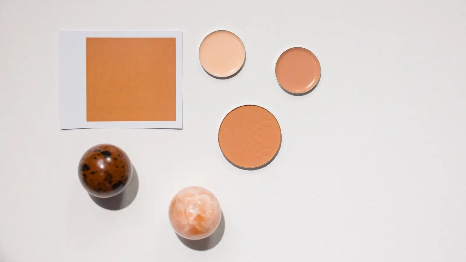
I keep a strip of white paper taped inside a cabinet door by a window. That is my testing ground, not the bathroom mirror. Bathroom light flattens everything into the same beige and it will forgive a foundation that daylight will not. The cabinet door catches the 9 a.m. light coming in sideways, and sideways light is where an orange foundation gives itself up.
So here is what I do with it.
A swatch is a recipe you can read
I draw a line across the paper, leave it alone for ten minutes, and then look at it the way I would look at a color correction — because that is essentially what it is. Iron oxides work like a correction palette for a photo.
Red iron oxide is what makes a foundation read ruddy, brick, or terracotta. Push it and you get orange. Yellow iron oxide sets the temperature; it is what turns a blend golden, sandy, or buttery, and it is the pigment that makes a warm shade read actually warm instead of just dark. Black iron oxide is the depth knob. A little goes a long way, and it is often doing more of the work in deeper shades than people assume, where the guess is usually "there is simply more pigment in there."
The useful part is that you can often see which of those three is out of balance, and the name of the shade will not tell you. A foundation reading too orange is not the wrong undertone. It is red doing more work than it should relative to yellow. That distinction is the whole game when you are trying to fix a bottle instead of replace it.
Same label, different recipe, different color
This is what made me stop trusting the word on the cap.
Call two foundations warm. The first is built yellow-heavy with a light hand of red. It reads golden. The second leans harder on red with just enough yellow to keep it from going pink. It reads orange. Same word, same undertone category, completely different recipe, and your eye sees the recipe.
Now add a third, also called warm, in a deeper shade where black iron oxide is carrying the depth. That one can read almost neutral, or faintly gray, because black mutes what red and yellow are doing underneath.
Olive gets handled the same way. What gets labeled olive is often a yellow-red blend cut with a small amount of blue or green — ultramarine blue and chromium oxide green show up in formulas for exactly this — or it is a blend where black is doing more of the depth work than red is. Both routes can end up under a label that says olive. On my skin, one of those looks right and the other looks like a mask, and the label gave me no way to know which one I was buying. That is the part that burns.
Two things that change the color without changing the recipe
How finely the pigment is ground, and how evenly it is spread
Pigment particle size and dispersion — how evenly the pigment is distributed through the base — change how saturated a foundation looks even when the ratio of yellow to red to black is identical. Clumpier or coarser pigment reads heavier, muddier, and sometimes more intensely colored than the ratio would suggest, because light is hitting uneven patches. Finer, well-dispersed pigment reads smoother and can look softer and lighter than its own ratio implies.
I have had two bottles that were supposedly the same shade, and the one that sat calmer on my skin was simply better dispersed. Nothing about the color recipe had changed. The texture had.
Whether the base is water or silicone
This one took me longer, because for a while I assumed I was imagining it. A silicone-based foundation puts the pigment in a more reflective medium, and the color can read a little richer and shift slightly depending on the angle you are looking from. A water-based formula tends to sit flatter and more matte, and it can look different once the water has gone — often slightly deeper.
Same pigments. Different vehicle holding them. Which is why I judge a swatch after dry-down, not while it is wet. Wet pigment lies.
Reading the ingredient list without over-reading it
You can learn something from the order. Colorants are listed after the base ingredients, and when titanium dioxide or zinc oxide sits high in the list, that formula is leaning on white for its opacity. On deep skin that is the ash risk: a heavy white load can pull a rich shade gray and flat. It is also the usual suspect for flashback in photos, because those white pigments bounce light back very efficiently. Zinc oxide especially.
Then there is the limit, and I had to learn this one the hard way. Iron oxides frequently appear as a group, and in the United States they can be listed under "may contain" in any order at all. So the ingredient list can tell you whether a formula leans on iron oxides or on white, and roughly how much white. It cannot tell you the ratio of red to yellow to black. It cannot tell you how finely the pigment is ground or how well it is dispersed. It cannot tell you what the color will do once it is on your face. It is a rough map, not a preview, and treating it as a preview is how you end up with a shelf full of bottles that all looked reasonable in the store.
Mixing toward the ratio instead of the label
Once I stopped shopping for the right word and started correcting a recipe, the bottles I already owned got useful again.
I mix on a small white dish, in drops, and I write the ratio down — two drops base, one drop of the thing that fixes it — because I will absolutely not remember it next week.
If a foundation is too orange, the problem is too much red relative to yellow. A drop of a yellower foundation pulls it golden. A drop of blue mixer pulls it toward neutral or olive, which is what I want when the orange is the entire problem and the depth is already correct.
If it is too pink or too cool, yellow is usually the answer. Not white. White does not warm anything. It just makes a shade lighter and, on deeper skin, ashier.
If it is too light but the direction is right, I look for what the ratio is missing instead of reaching for a whitening drop. Lightening a deep foundation with titanium dioxide is how you end up with a gray cast and flashback in the same bottle. Blending with a lighter foundation that shares the same basic yellow-red-black direction keeps the color honest.
And whatever I mix, I wait. Ten minutes on paper. Then on the jaw and down the neck. Then one photo with flash, because flash is where the white pigments confess.
What the label is actually for
The label is a starting point, not a description. It narrows the shelf. It tells you which direction someone in a lab was leaning when they built the ratio. After that it is between you, the pigment, and the light you actually live in.
The reason the same undertone name looks different on different people is not only that their skin is different, though it is, and the color sitting underneath a foundation changes what the foundation reads as. It is that these words describe directions rather than destinations, and directions can be walked at different speeds. Two warm foundations are both headed north. One of them is moving a lot faster, and by the time it reaches your jaw, it has arrived somewhere else entirely.
About the author
The Undertone
The Undertone is a byline for people who learned foundation on brown skin by swatching, mixing, and checking color in real light. They share a practical focus: if the depth and undertone are right, the formula will follow.
More about us