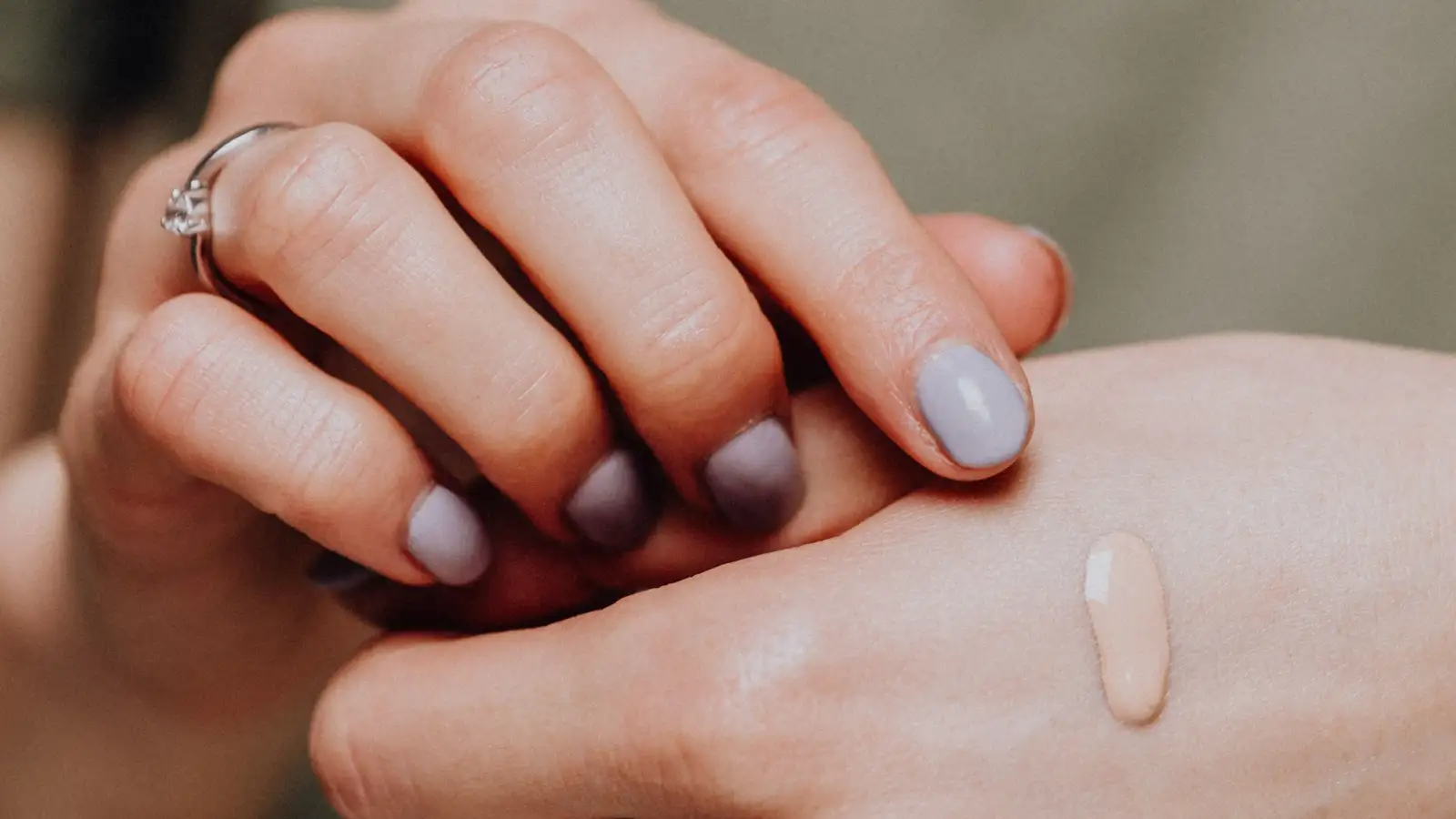
Swatch Foundation in Natural Light and Finally Get It Right
Swatch foundation in diffuse daylight a few feet back from a window — never in direct sun, never under the lights at the counter. Draw three parallel stripes from the jawline down onto the neck, leave them alone for five to ten minutes, and read depth first and undertone second, at two angles, against bare skin. Only after that read do you take the same stripes into artificial light, because the question that actually matters isn't whether a shade looked right in one light. It's whether it holds when the light changes.

I've done this in a bathroom with a window the size of a shoebox, and I've done it sitting on the floor of a rental with the blinds half up. The setup barely matters. What matters is that the light is the same light every time, and that you don't cheat the clock.
The window is the only equipment you need
Stand about three feet back from a window the sun isn't currently shining directly through. In most US homes that means a north-facing window, or any window in the early morning and late afternoon when the sun is low and off to the side. Hold your hand up in the light. If you can see the texture of your skin and the shadow under your fingers is soft-edged, you're in the right place. If there's a hard shadow line on the floor, you're standing in direct sun and you're in the wrong place.
Direct sun does two things that ruin the read. It overestimates depth — everything looks lighter and brighter than it is, so a shade that's a full step too dark can pass. And it pushes a warm cast that your eye corrects for within seconds, which means you stop seeing the color that's actually there. Shade, or light bouncing off a nearby wall or building, keeps contrast intact. That contrast is the whole point. You need to be able to see where the shade stops matching you.
Time of day is part of the setup. Midday sun through a south or east window is a moving target. Ten in the morning and four in the afternoon through a north window are close enough to each other that you can compare a swatch today to a swatch three days from now.
Make it repeatable before you make it accurate
The same window, the same time of day, the same bare skin. Clean the jaw and neck of whatever's already there — you can't compare a new stripe against a layer of old product and learn anything. Let moisturizer absorb for a few minutes first; product slides and settles differently on a slick surface.
Take a phone photo with no filter and no flash, same distance every time. It's not for posting. It's so that tomorrow you can look at yesterday and check whether you're actually seeing a difference or just remembering one.
Three stripes, not one
One stripe tells you almost nothing. Three running parallel from the jaw down onto the neck, maybe a finger's width apart, tell you how a shade behaves across the transition — and the jawline is where mismatch shows up first in daylight. It's also the line other people look at when they're talking to you.
Write down which stripe is which. After ten minutes you will not remember, and you will absolutely convince yourself that the one you liked best was the one on the left.
If a stripe crosses from your jaw onto your neck and the color seems to shift as it crosses, that's not a trick of the light. Your neck and your face sit at different depths, and that's normal. Decide, once, which one you're matching — most people match the neck for everyday wear, because the face otherwise reads as a floating mask — and then adjust the face toward that depth rather than the other way around.
Wait the full ten minutes
This is the part everyone skips, and it's the part that causes the surprise.
Some formulas change color as they sit. They oxidize — the pigment reacts with air and with your skin and shifts warmer, darker, or more orange than it looked wet. Others just dry down a half step deeper as the water or solvent leaves. Others lose a sheen that was making them look lighter than they are, and once that sheen is gone the real depth shows up.
Judging a wet stripe is judging a color you're never going to wear. Don't blend it, don't smudge it with a finger, don't tap it out at the edges. Leave it. Come back.
Read depth first, then undertone
Depth errors are bigger and easier to see, so get them out of the way first. Compare each stripe against bare skin right at the jaw edge. Lighter, same, or darker. That's it. No verdict beyond that yet.
Undertone is the harder read, and the two-angle trick is what makes it possible. Turn your head so the stripe falls into the natural shadow under your jaw. Then turn back so it's fully lit. If the stripe's relationship to your skin changes between those two positions — it looks like a separate patch in one and almost disappears in the other — you're probably looking at an undertone mismatch. If it just reads as a light patch or a dark patch in both positions, that's depth, and it's the simpler fix.
The reason this matters is that your skin has surface color that isn't undertone. Healing spots, freckles, patches that are darker or redder than the skin around them. A stripe that happens to sit over one of those patches and matches it will look correct in that one spot and wrong two inches over. Check next to clean, unbroken skin. Check twice.
Ashy isn't a bad product
When a swatch goes gray or chalky or dusty on deeper skin, that's information about the shade, not a verdict on the formula. It usually means one of two things, and often both at once. Either the shade is too light, so the white base in it lifts the surface and mutes everything under it. Or the undertone is wrong — a cool or neutral base sitting on warm or olive skin will go gray every time. A perfectly good formula can do this to you.
The fix is almost never "use more." It's usually a half step deeper, a warmer one, or less product sheered out so your own skin comes back through.
Use a hand mirror, and get your body out of the way
Standing at the bathroom mirror is the most common mistake, because you're standing between the window and your face. You block your own reference light and don't notice you've done it.
Grab a small hand mirror. Stand with the window at your side or slightly behind you, and angle the mirror so it catches the daylight. Your face is lit, your body isn't in the way, and you can turn your head through both angles without moving your feet.
Then, and only then, check artificial light
You don't live in daylight only. Two colors can match under daylight and pull apart under fluorescent or LED — that's metamerism, and it's the reason a shade that looked perfect outside can look wrong at your desk.
Take the settled stripes under a cool white LED, the kind in most offices, and then under a warm indoor bulb. Watch for the stripe going pink, orange, or gray relative to bare skin. A phone flashlight held at arm's length works as a third check if you don't have a good bulb nearby.
You're not hunting for a shade that matches under every light. Almost nothing does. You're looking for which lights make it fail worst, and whether you can live with that. A shade that's right in daylight and slightly warm under office lighting is a better everyday choice than one that's perfect under LED and ashy the moment you walk outside. Daylight is the reference. Artificial light is the stress test, and it's the part you run before you decide anything.
What right actually looks like
It looks like a process you can repeat. Same window, same time, three stripes, ten minutes untouched, two head angles, then the light tour. Notes you can actually read back later.
The honest limitation is that this takes more than one sitting. You might run it three days in a row before you trust your own read, and if your skin shifts with the seasons you'll run it again in a few months. That's not a flaw in the method. That's just what matching actually costs.
Most people don't get this wrong because they can't see color. They get it wrong because they evaluate under the wrong light, at the wrong time of day, wet instead of settled, with one stripe instead of three, and with their own body standing between the window and their face.

About the author
The Undertone
The Undertone is a byline for people who learned foundation on brown skin by swatching, mixing, and checking color in real light. They share a practical focus: if the depth and undertone are right, the formula will follow.
More about us