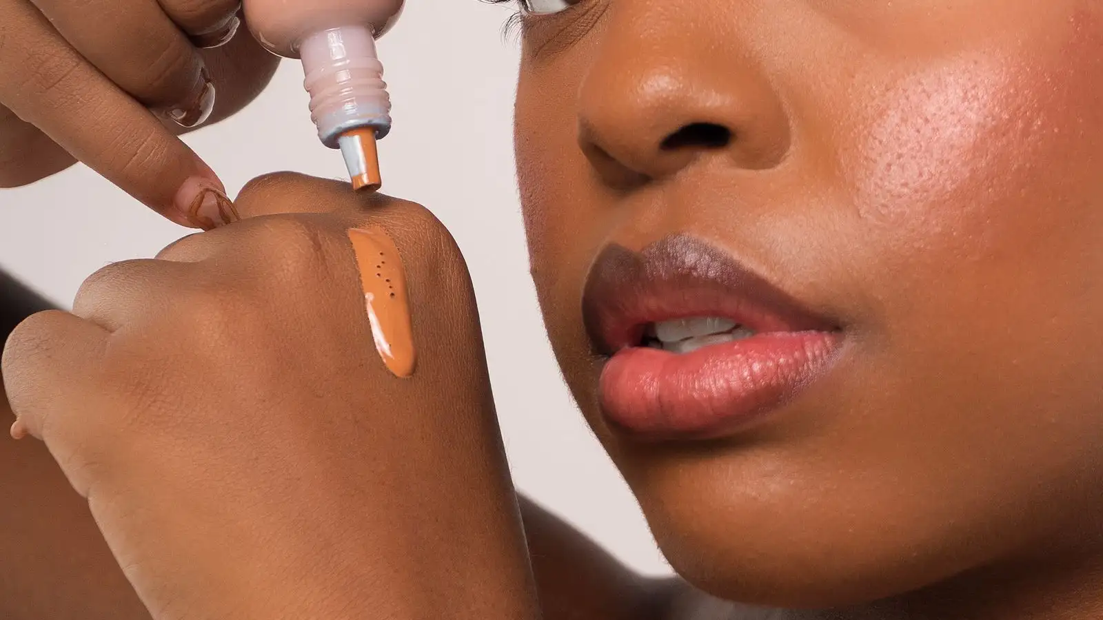
One Drop of Blue Fixes an Orange Foundation on Deep Skin
One drop of blue is the right correction for a foundation that pulls orange, and for a full pump of deep-tone foundation one drop is usually the entire correction. Blue sits directly across from orange on the color wheel, so it cancels the orange rather than layering over it, and deep bases carry enough pigment that the amount needed to move the color is smaller than most people expect. The failure is almost never too little pigment. It is a second drop added before the first one has been folded in.

I mix on a flat plastic palette on the windowsill, not on the vanity, because the window is the only light in this apartment that doesn't lie to me. The bathroom bulb flatters everything. It turns a base that reads orange at my jaw into something that looks passable, and I have walked out of the house on that lie more than once. So the palette sits in the window at around seven forty in the morning, next to a pump of the foundation I already own.
Here is the moment I want you to picture, because it is the whole skill. The pump lands on the palette looking fine, maybe a touch warm, nothing alarming. You draw a thin stripe of it across the plastic with the flat of the spatula and let it sit for a second while you look at it against the daylight. The stripe is thinner than the pump, so it dries a little, and the orange shows up there — a warm band, like the color of a penny under a lamp. That thin stripe is the color that will be sitting on your jaw at eleven in the morning. The wet blob is not.
Then the blue. It goes onto the palette, never into the bottle. You don't take the drop. You touch the very tip of the spatula to the bead, lift a fraction of it, and fold that fraction into the stripe, back and forth, until the stripe and the palette are one color. Everything below is just the reasoning behind that fraction.
The wheel, and the order I correct in
Mixers are concentrated pigment pastes. They aren't thinned foundation and they aren't tinted primer. What they do is let you change the color of a bottle you already own instead of replacing it, which matters most when the shade you bought is right in depth and wrong in cast.
Every one of them works by cancellation or by addition. Which one you need depends on which side of the wheel your base is sitting on.
Blue cancels orange. This is the one that gets used most on deep skin, because so many deep foundations are built warm and then oxidize warmer — they go peach, then orange, then a kind of burnt sienna by mid-afternoon. Blue pulls that back toward neutral or cool, depending on how much you use.
Green cancels red. It's for a base that pulls pink or ruddy on your skin. On deep foundations it's a smaller tool than blue, and it goes gray quickly, so it's a fraction of a fraction.
Lavender cancels yellow. A very golden foundation that looks neon in daylight is the case for it, and again, tiny. Lavender overshoots into a bruise-gray on most deep bases within a drop.
Yellow adds golden warmth without adding depth. If your base pulls pink, gray, or purple on you, yellow walks it back toward golden. Watch the base's own red content, though. Yellow plus a base that already carries red makes orange, which is how people end up in a loop, chasing a pink base with yellow until it turns peach.
Peach or orange adds warmth and depth, and it's the fix for a base that reads ashy — gray, flat, drained of color. On deep skin peach does two jobs at once where yellow does one. If your base already leans orange, peach is the wrong tool and you are making your own problem worse.
White lightens depth, and it is the most dangerous of the set on deep skin. White pigment scatters light. On a deep base it doesn't just make the color lighter, it takes chroma out of it. The color goes chalky, and a few drops too many and the whole thing reads gray or faintly pink under flash. If I need real depth, I buy a lighter base and fix the undertone with pigment rather than trying to lift a deep base with white. When white is unavoidable, I put chroma back afterward with a touch of yellow or peach, because the white has just removed some.
Now the order: cast first, depth last. Most people do it the other way. If you whiten first, you mute the base, and then your blue reads differently against a muted ground than it did against the original, and you end up adding twice as much of both. Fix the orange, look again, and only then decide whether depth still needs to move. Usually it doesn't. The orange was what made it look heavy.
Less than a drop
The skill isn't knowing which pigment. Most people get that far. The skill is adding an amount small enough that you can walk it back, and that means working in fractions of a drop.
A drop squeezed straight from the tube is already a lot of pigment for one pump of foundation. So I don't squeeze into the mix. I put a single bead on the corner of the palette and work off that bead for a week. To pick up pigment, I touch the flat tip of the spatula to the bead and lift whatever sticks, which is a fraction of the bead. If you want repeatability, pull a drop onto the palette and divide it with the spatula edge into quarters, like a tiny pie, and use one quarter.
You'll know you've gone over when the color stops moving toward the target and starts going somewhere else. The orange disappears and what's left is dull, or greenish, or gray. Once that happens, adding more of anything doesn't recover it. You add more foundation and start again with a smaller fraction.
Ratio notes matter more than memory. I put a strip of masking tape on the bottle and write the ratio on it — one pump, tip-of-spatula blue, half that much yellow — because a bottle's own color drifts as it sits, and what worked in March won't be the same in July. The note tells me where I started, not where I have to stay.
Blend until the smear is one color
Mixers are pigment paste. Paste doesn't dissolve into foundation. It disperses, and if you stop dispersing too early you get a base that looks blended on the palette and then shows up as a faint blue stripe on your cheek at noon.
The check is a smear, not a swirl. Once you think it's blended, spread the thinnest possible film of it across the clean part of the palette and tilt it toward the window. If there's a ribbon of orange sitting next to a ribbon of cool brown, you aren't done. When it's actually blended, the thin film reads as one flat color, top to bottom, no sheen breaks, no streaks. That flat read is what you want on your face.
I do the first build on the palette, because plastic doesn't warm the product or tint it. Then I check the jaw-to-neck line, where the face stops and the light changes, and where a wrong cast is loudest. The back of the hand is the other option and a good one — the hand is warmer than the palette and closer to what your face will do to the product. But the hand has its own color, and on deep skin a dark hand can make a too-cool base look correct when it isn't. My compromise is palette for the formula, jaw for the verdict.
The full day is the test
A mixed foundation is a new formula. You've changed the pigment load, and by changing it you've changed the ratio of pigment to the film-formers that actually hold the product on your skin. That's why mixers can quietly cut wear time, flip a matte finish to something dewier, or make a base separate around the nose by three in the afternoon even when the color is perfect.
So the color test is a full day, not a mirror. I mix enough for one side of the face, wear the original on the other side, and compare at hour six and hour eight: the color at the nose and chin, whether it's gone orange again, whether it's pooling, whether the finish still matches. It's a cheap test and it's the only one that tells you anything.
Base compatibility is a separate test, and it happens before you touch your face. Water-based mixers and silicone-based foundations don't always want to live together, and vice versa. You can see it on the palette. If a small batch starts to bead, or a thin liquid film forms at the edge, or the texture goes grainy, the two are separating. Let a small batch sit fifteen minutes before you commit a whole pump. Plenty of modern bases are emulsified well enough to tolerate the mismatch, but you find that out by testing a small amount, not by finding out on your face at a wedding.
One more thing about committing. I mix what I'll use that day or that week, in a small separate jar if I need to, and I don't tip pigment into the foundation bottle unless I've decided the ratio is permanent. Pigment paste dilutes the preservative system in the bottle, and once it's in there you can't take it back out. The bottle is a fixed asset. The palette is where the experimenting happens.
Blue gets the headline because it does the dramatic part. What actually decides whether the mix works is the size of the increment, and the discipline to stop at the fraction that moved the color instead of the drop that moved it past. Once you can measure in tips of spatulas, the wheel is the easy half. You already know blue sits across from orange. The part nobody teaches is the hands.
About the author
The Undertone
The Undertone is a byline for people who learned foundation on brown skin by swatching, mixing, and checking color in real light. They share a practical focus: if the depth and undertone are right, the formula will follow.
More about us