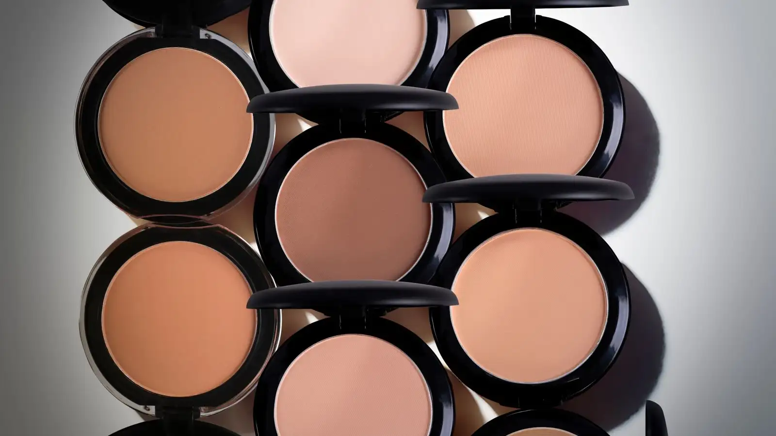
Patchy Color Isn't Your Shade, It's the Pigment Grind
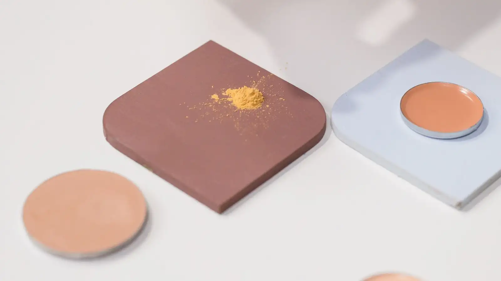
Patchy color is a pigment-grind problem before it is ever a shade problem. When one formula goes on streaky and another formula of what looks like the same color goes on smooth, the difference is not depth and it is not undertone — it is particle size, how evenly those particles were dispersed into the base during manufacturing, and whether the surface of each particle was treated to keep it from drifting. Those three properties decide whether the colorant blends into the film and reads as color, or rides on top of it and reads as streaks. Switching shades is the one adjustment that touches none of them.
Stand at the north window in the morning, the one that gives flat, honest light, and draw a single stripe of foundation down the side of your jaw with your fingertip. Then watch it for thirty seconds instead of blending it out. In the middle of the stripe the color sits there looking like the color. Along the top edge near the ear, and again down by the chin, the stripe breaks into fine lines, thin as thread, and the color between those lines goes a half-step lighter. That pattern is what most people call a bad match. It isn't. What's happening is that the film has decided where the pigment is allowed to live, and I can usually tell which of those three properties is responsible just by looking at the shape of the break.
Start with a stripe on something that isn't your face
Before I change anything, I take the product off the variable. Skin moves, it's warm, it has oil on it, and it isn't flat. So I draw two stripes on the back of a clean compact mirror or a white ceramic tile — one with my finger, one with a small silicone spatula. Same product, same amount, two tools. On glass there's nothing to interfere: no film to break over a crease, no surface oil grabbing at the pigment. Whatever shows up in that line is coming from the formula itself.
If the finger stripe is smooth and the spatula stripe is streaky, or the reverse, you're watching shear do the work. A spatula drags product across the tile and forces pigment to wet out. A fingertip does almost none of that. If both stripes come out streaky, you're looking at pigment that never fully dispersed in the bottle, and no amount of layering, powdering, or shade-swapping downstream will fix something that was settled at the mill.
Finer grind reads deeper; clumps read chalky
Pigment doesn't arrive as free-flowing dust. It arrives in clumps, and the manufacturer's job is to wet those clumps out, break them apart with shear, and hold the separated particles apart with dispersants so they stay apart. The finer and more evenly separated the particles, the more light the color absorbs and the deeper and more saturated it reads. Particles still stuck together in agglomerates don't just sit there inertly — each clump scatters light in every direction, so what reaches your eye is the pigment's own color mixed with a lot of bounced white light. That is the chalk.
Two tablespoons of cocoa powder show this better than any swatch. Sift one and dump the other into a cup of water. The sifted one blooms dark brown and spreads. The dumped one floats in dusty islands and reads lighter than it actually is. Same cocoa, same color, different grind. Every chalky, ashy, "why does this turn gray on me" moment I've had traces back to that, not to the shade being wrong.
Surface treatment is the part you can feel on your finger
After pigment is milled and dispersed, it usually gets coated — a thin layer of silicone, a silane, or an amino-acid treatment like lauroyl lysine. The coating is what makes the particle resist oil and water, and resistance matters because it controls where the pigment travels after you put it on. Treated pigment stays where it lands. Untreated pigment gets pushed around by your own oil and by whatever is in the base, and by four in the afternoon it has migrated somewhere you didn't put it.
There's a real tradeoff here, and this is the part most explanations skip. Over-treated pigment resists the base as much as it resists your skin. If the coating is a poor match for the carrier, the pigment won't wet out properly, it drops out of suspension in the bottle, and you get separation you can see when you pump. And know this: shaking re-suspends pigment, it does not re-disperse it. Once particles have flocculated into clumps, no amount of wrist action shears them apart again. You're just moving the clumps around.
High in the film, low in the film
Where the pigment ends up vertically inside the film matters as much as how fine it is. A formula built on volatile silicones flashes its carrier off quickly and concentrates pigment near the surface. That reads very visible and very saturated — and it also transfers, because it's sitting right there to be touched. An emollient-heavy base keeps pigment lower in the film, closer to the skin, where it reads softer and flatter, sometimes a little grayer than it looked in the jar.
This is why a shade can look perfect in the store swatch and wrong ten minutes later at your desk. Different bases evaporate different amounts, and the color you saw at the moment of application is not the color you're left holding.
The break pattern tells you which problem you have
When the film is level, the color is level. Wherever the film thins or lifts, pigment migrates with the carrier toward that thinner area and stacks up at the rim of it. If you've ever watched a coffee drop dry, you've seen it: the ring at the edge is darker than the middle, because liquid flowed outward and left the solids behind. Foundation does the same thing at a smaller scale.
So the two failure shapes look different, and once you know them you can't unsee them.
Streaks that follow the direction you applied — lines running the way your fingers went — are dispersion. The pigment was never fully separated, and the tool is dragging it into a pattern.
A mottled, uneven, pooling read that has nothing to do with your application — concentrated at the edges of the film, lighter where the film stretches thin — is leveling. That's the film breaking over anything that isn't flat, with pigment gathering at the boundaries: the crease at the corner of your mouth, the seam along the jaw, the hairline where the film stops. In that case there is genuinely nothing wrong with the color. You have a film problem, and it lives at the edges.
What this changes about how you shop
Once patchiness reads as a formula behavior, the shade card stops being the most useful thing on the counter. What I want to know is how the product draws a line on glass, how it looks at the twenty-minute mark rather than the two-minute mark, and what sits near the top of the ingredient list — the base tells you where the pigment is going to live.
One more test I run: a rice-grain of product on the tile, worked with a drop of something thin that's already on the shelf — a watery serum, a silicone primer. If a bit more shear and a better-wetting carrier pull the line together, the pigment was fine and the base was fighting it. If it doesn't budge, the grind is the grind.
And I want to be honest about the limits. Some of this you cannot fix from outside the bottle. A badly dispersed grind is a badly dispersed grind, and if you've sheared it on a tile and it's still streaky, this formula is not going to behave differently on your face. What you can do is stop the diagnosis from landing on the wrong variable. If the stripe is smooth on glass and broken on your jaw, you already know the color is fine — and you're chasing a leveling problem with shade changes, which is a slow, expensive way to go nowhere.
The shade in the jar is a color. What you wear all day is a formula. Those are two different purchases, and only the second one shows.
About the author
The Undertone
The Undertone is a byline for people who learned foundation on brown skin by swatching, mixing, and checking color in real light. They share a practical focus: if the depth and undertone are right, the formula will follow.
More about us