What Pigment Chemists Really Mean by Depth and Undertone
Foundation is a pigment system with three independent dials, and depth and undertone are only two of them. Depth comes from how much black and brown iron oxide is in the mix. Undertone comes from the ratio of red iron oxide to yellow iron oxide. Opacity comes from how much white mineral pigment — titanium dioxide, zinc oxide — is loaded on top of those. The shade name on a bottle points to a position in that system; it does not describe the chemistry, which is why two bottles carrying the same word can behave like two different colors on one face.

Two blobs on the same tile
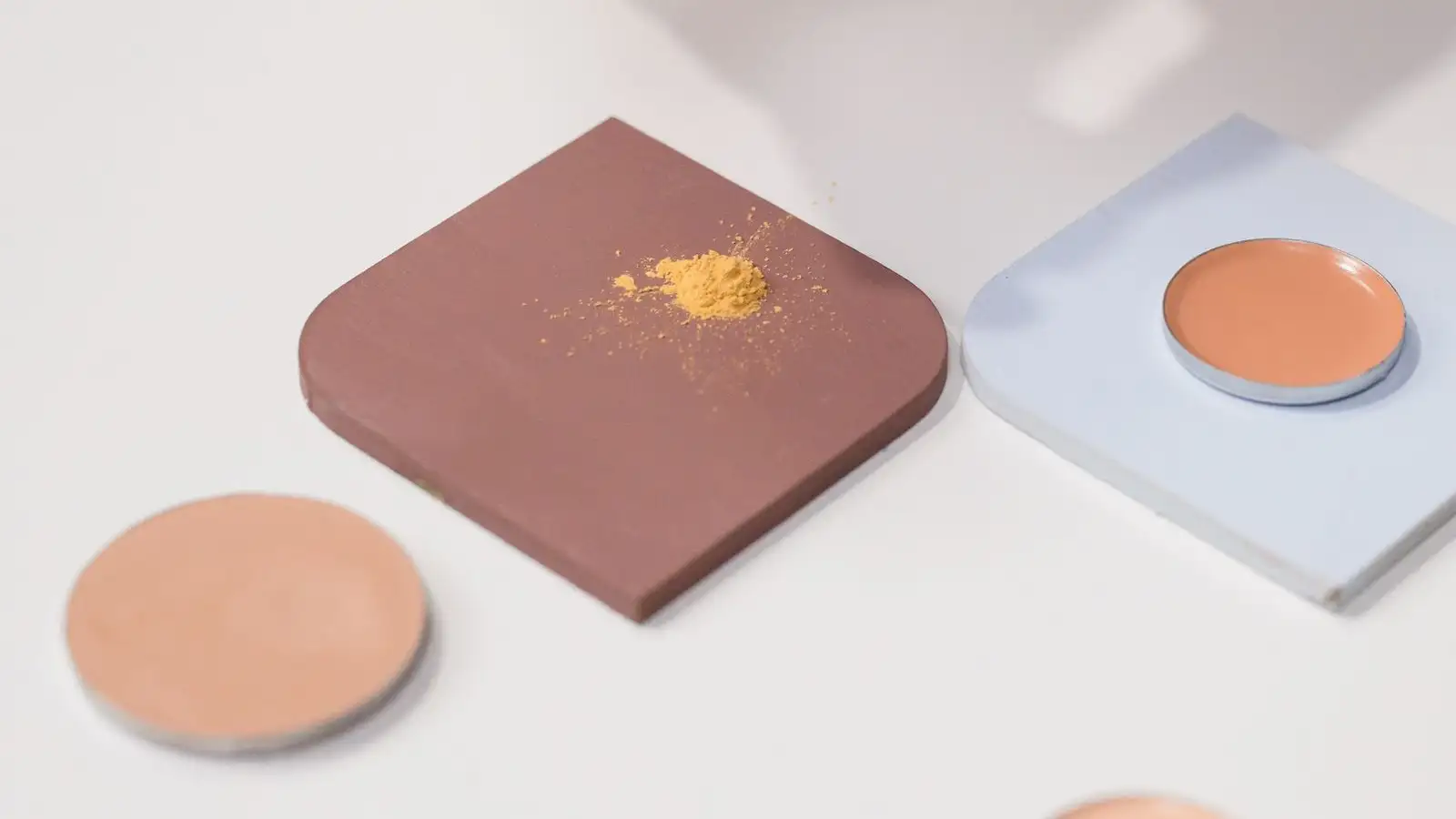
The tile sits on my counter under a north window, because north light is the only light in my house that does not lie. I squeeze two blobs onto it. Same depth word on both labels. Same undertone word. From six inches away they are the same color.
Then I drag the edge of a palette knife through each one, drawing them down thin, and the agreement falls apart. The left streak goes olive at the edges — a gray-green shadow where the film thins. The right streak goes rust, almost terracotta, and stays warm all the way out to the feathered edge. Under the phone flashlight I have propped at a low angle, raking across the tile, the left one turns flat and powdery and the right one goes glossy and deep.
Nothing about the names changed. The pigment load did.
I started working this way because I got tired of being wrong in the same direction twice. A bottle reads as a promise. A drawdown reads as a fact. Once you can see the three dials separately on a piece of glass, you stop blaming your face for what is actually a formulation difference.
The dials do not move together
Iron oxide colorants are a small family. Red, yellow, black, and — commercially — brown, which is usually itself a pre-blended ratio of the other three so a formulator does not have to weigh out three powders. That is the entire colorant set for the overwhelming majority of complexion products. Everything you have ever swatched is some combination of those plus white.
Because they are separate powders, they are separate decisions. Depth goes up when you push black and brown. Warmth goes up when the red-to-yellow ratio tips toward red. Cover goes up when titanium dioxide or zinc oxide goes up. You can raise depth without touching warmth. You can warm a shade without deepening it. That sounds obvious written down, and it is the single thing most people never get to use, because a bottle only ever hands them the finished sum.
Here is where the reasoning pays off: if a shade is wrong, at least one dial is wrong, and knowing which one tells you what to do about it. Too light or too dark is depth. Too gray, too pink, too yellow, too green is undertone. Too flat, too chalky, too washed out against your skin is usually opacity and grind, not color at all.
Why deep shades go gray
This is the one that costs people the most.
To make a shade deep, you need dark pigment. To make a deep shade cover, you also need the film to hide what is underneath it. Those two goals pull against each other, because the thing that hides is white. So when a formula leans on the opacifier load to get coverage into a deep shade, the white pigment lifts the value while it flattens the chroma. Deep plus white is not deep. It is gray. Push a light-scattering white high enough and even a strong black-brown blend reads like charcoal dust in daylight.
That is the mechanism behind the deep shade that looks rich in the bottle and ashy on the face. It is not your undertone. It is a white opacifier doing exactly what white opacifiers do. I look for it on the label now: titanium dioxide sitting high in the list, no dark oxide anywhere near it, and the bottle is telling me the truth about itself.
You can watch the same effect in the other direction under flash. A heavy white load bounces a camera flash straight back at the lens and the color underneath disappears for the length of the exposure. The shade did not change. The opacifier did its job too well.
The ratio that decides how much of you shows through
Pigment-to-filler is the quietest variable in the whole system. Fillers — talc, mica, silica, the powders that give a formula body — carry no color. Their job is texture, slip, bulk. But the ratio of pigment to filler decides one thing above all: how much of your own skin color comes back up through the film.
A pigment-dense film blocks you out. A filler-heavy film is essentially tinted glass. It lets your own redness, your own depth, your own yellow come up through it and mix with the colorant sitting on top. That is why a sheer shade can sit beautifully on one person and turn muddy on another with the same depth. The formula is not finishing the color. Their skin is.
It is also why a swatch on the back of the hand keeps disappointing people. The hand is not the face. Different thickness, different tone, different oil, different light. The hand tells you something about depth and almost nothing about how the film will behave once your own color is in the mix.
The base is a dial too
The same red-yellow-black blend in a volatile silicone base and in a heavier oil base is not the same color on skin. This catches people who found a shade they trusted and then bought it in a different format.
The base decides how the pigment spreads, how thin the film settles, and how light comes back off it. Silicone-heavy formulas tend to lay flat and even and dry down quickly, and the pigment reads close to its true color. Oil-heavy formulas move around longer, sit slightly richer, and often read warmer because of how they reflect. Water-based formulas can dry down cooler and a touch flatter as the water leaves. Identical colorants, three different colors on the face.
It is also the honest answer to why a shade seems to change when a formula gets reformulated and the colorants stay the same. Nothing about the pigment moved. The vehicle underneath it did. A pigment dispersed in a different medium spreads differently, reflects differently, and finishes differently.
Grind matters as much as color
Two formulas can carry the exact same blend at the exact same load and not look related, because of how finely the pigment is dispersed. Pigment that is fully wetted and evenly spread reads saturated and clean. Pigment that is clumped scatters light before that light can be absorbed, and scattered light reads lighter, dustier, chalkier. Same colorant. Different apparent color.
You can watch dispersion change in the bottle. A formula that has been sitting separates. The pigment settles. The first pump out of it is thin and off. Shake it properly — a real shake, not a wrist flick — and it comes back. The colorant never changed. Its distribution did.
Why a shade drifts by afternoon
People call it oxidation. Sometimes it is. More often, your own sebum has worked its way into the film and started wetting the pigment, and pigment wetted by oil reads differently than pigment sitting dry in a base. Add volatile ingredients leaving over the course of the day, which concentrates whatever pigment is left behind, and you get a film that quietly deepens and warms.
This is where surface treatment on the pigment particle earns its place. Coat the particle so it resists oil and the color shift slows down, because your skin's oil cannot get in and change how the particle reflects light. It is not skincare and it is not doing anything for your skin. It is a coating that keeps the colorant stable inside the film, which is a completely different job.
Reading a bottle instead of a name
The practical version of all of this, and the one I actually use:
Decide which dial is wrong before you do anything else. Too light or too dark is depth. Too gray, too pink, too warm is undertone. Too flat or too washed out is opacity and grind. Most disappointing shades fail on one dial, and people give up on them over the wrong one.
Read the ingredient order. Pigments and opacifiers are listed in descending order of amount, so where titanium dioxide sits tells you how much white you are dealing with. A deep shade with titanium dioxide high in the list and no dark oxide anywhere near it is a gray shade wearing a deep name. That is not a prediction about any particular product. It is arithmetic on the label.
Swatch on something neutral and non-porous — glass, a white tile, the back of a ceramic plate — and draw it down thin. Thick swatches hide undertone. The thin edge is where the color tells the truth.
Check that drawdown in daylight first, then under a phone flashlight held at a low angle. Daylight tells you undertone. Raking light tells you opacity, grind, and whether the film is going to go flat on you.
Then adjust the dial you identified with something you already own: a deeper mixer for depth, a warmer or cooler mixer for undertone, a sheerer base to cut a film that is covering too much of you. Layering is a pigment decision, not a compromise. Once you can name the dial you are turning, you stop guessing at the whole bottle.
The name is a word someone chose. The three dials are the color.

About the author
The Undertone
The Undertone is a byline for people who learned foundation on brown skin by swatching, mixing, and checking color in real light. They share a practical focus: if the depth and undertone are right, the formula will follow.
More about us