Three Iron Oxides Make Every Brown Foundation Shade
Every brown foundation shade is built from the same three cosmetic iron oxides: red, yellow, and black, plus pre-blended browns that are themselves ratios of those three. Depth, warmth, and saturation don't come from different colorants; they come from how much of each oxide sits in the blend, and every shift in that ratio moves the color in a direction you can learn to predict. Shade names are vocabulary layered on top of that arithmetic.
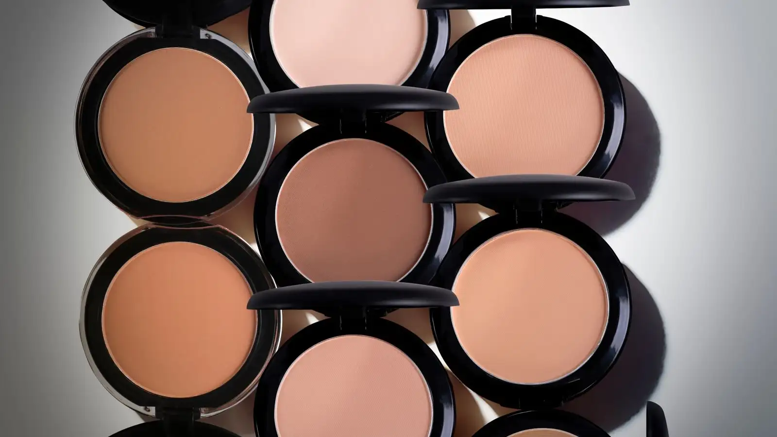
I keep two bottles on the windowsill and a white ceramic tile in the drawer underneath. Under the store lights they read as the same depth. At the window, on the back of my hand, one sits there gray and a little airless, like a bruise on the way out. The other goes orange along the edge where it meets skin. Same depth, opposite problems, and neither one is a mystery. The explanation is printed on the back of both bottles, inside the same set of parentheses.
The whole brown range is three CI numbers
Pick up any foundation in the brown range, from the lightest tan to the deepest espresso, and read the ingredient list. You will find the same three names over and over: Iron Oxides, followed by CI 77491, CI 77492, CI 77499. Red, yellow, black. A brown iron oxide often appears too, but brown isn't a fourth mineral with its own color. It's a pre-blended combination of the same three, sold to formulators so they don't have to build the ratio from scratch every time. Titanium dioxide is in there as well, plus the base, the emulsifiers, the film-formers, and the preservatives. None of those are the color. The color is the three oxides.
That single fact reorganizes the whole shelf. If every shade is a ratio, then "medium deep warm" isn't an ingredient you can go and find. It's a position in a triangle, and the triangle has three directions you can move in.
What each oxide does when you add it
Red iron oxide, Fe2O3, is the one that pushes a blend toward red or peach. It's high in chroma, and it's relatively opaque, so it changes the color fast. Yellow iron oxide, FeO(OH), pushes the blend warmer in a golden direction, more olive-adjacent at depth and more golden at mid-depth. Black iron oxide, Fe3O4, is the one that lowers lightness, and it does something else at the same time: it lowers saturation. Black is a desaturator as much as it is a darkener. That's the detail most shade conversations leave out, and it's the one that explains why some deep foundations look dead on the face.
So the two questions people actually ask, how deep is it and is it warm or cool, come apart cleanly:
- Depth is set by how much black is in the blend, plus the total pigment load.
- Warmth is set by the red-to-yellow ratio. More red, more red or peach. More yellow, more golden. That ratio is what "warm, neutral, cool" is describing, and it has nothing to do with depth.
- Saturation is set by how much of the depth work is being carried by black instead of by red and yellow.
Once you have those three axes, a name like "neutral medium deep" stops being information and starts being a label someone printed.
Reading your own swatch as a ratio
This is the part I actually do, usually on a Saturday around noon, at a north-facing window with the lamp off. I draw a stripe from the edge of my jaw down onto my neck, not the wrist, which is a different depth and a different undertone than my face, and I let it sit for a few minutes before I judge it. Then I read the failure, not the shade:
- Right depth, but gray or ashy against the neck. Black is carrying too much of the blend, and chroma is low.
- Right depth, but the edges go orange or pink. Red is high in the ratio, or the base is evaporating and leaving the red reading harder.
- Right depth, but brassy, gold, or slightly green in daylight. Yellow is high.
- Wrong depth in a way that no angle fixes. That's total load, not undertone, and more warm or more cool won't solve it.
The point isn't to diagnose a single bottle. It's that each failure points in a direction. Gray means you need to move away from black and back toward red and yellow. Orange means you need less red. Brass means less yellow. If you know the direction, you can mix your way out of it with what's already in the drawer.
Two medium deep shades, same depth, different undertone
Here's where the pre-blended browns earn their place. A brown oxide lets a formulator reach mid-depth with fewer colorants in the mix, less black and less of everything else, and then tilt the warmth with a small amount of red or yellow on top. Two shades built that way can sit at exactly the same value against a gray card and read completely differently on a face. One is a red-leaning medium deep. One is a yellow-leaning medium deep. Neither is wrong. They're just different ratios wearing the same name.
If your swatches keep coming up sort of close but not quite, this is usually why. You're not between depths. You're between ratios. Dropping half a shade lighter won't fix a red-to-yellow problem.
Why golden deep shades feel sheer
Yellow iron oxide is the least opaque of the three. It's the one that lets light through, which is fine at the top of the range and a real headache at the bottom of it. To hit the same coverage in a deep, golden-leaning shade, the total pigment load has to be higher than in a deep shade carried mostly by red and black. In practice that means a deep golden foundation can feel like it's sinking into the skin and disappearing no matter how little you use, and you end up layering it, and layering changes how it wears.
The tempting fix is titanium dioxide, which raises opacity. But titanium dioxide also whitens, and in daylight and on camera it's the usual suspect behind a chalky cast or flashback. Raising opacity is not the same operation as raising warmth, and mixing the two up is how a deep shade ends up looking like a mask.
Why some deep shades look flat
Push black far enough and you get depth without life. The shade is technically dark enough, the value matches, but the chroma is gone, so it reads gray, ashy, or dull against skin that has its own color underneath. This is the most common complaint about deep foundations and the least often explained correctly. It isn't that the shade is too dark. It's that the depth was bought entirely with black, at the cost of saturation.
The direction out is to bring chroma back with red or yellow rather than to go deeper or lighter. If a deep shade is flattening you, look for one where some of the depth is carried by red or a brown blend, or mix in a small amount of a shade that reads too warm on its own. You're not chasing a different depth. You're buying back saturation.
Mixing at home, and what it costs
The tool that makes all of this usable is a flat white tile, or a piece of white paper, and a spatula. A dot of the too-gray shade, a smaller dot of the too-warm one, mixed to a uniform streak, gives you a ratio you can see. Start with the gray one as the base and add the warm one in small increments, because the warm shade usually has more chroma per volume than you expect.
Loose cosmetic-grade iron oxide powders are cheap and easy to find, and it's genuinely tempting to buy a jar of yellow and fix everything. I'd hold off, or at least go in knowing the cost. Adding powder to a liquid foundation changes the film and the texture, and it dilutes the preservative system that was keeping the bottle stable. Once you've opened a bottle and stirred pigment into it, treat it as a short-lived product, not one that will sit on the shelf for a year. Keep the powder away from your face while you work; fine pigment dust isn't something you want to be breathing in a small bathroom. Mixing two finished foundations gets you most of the same control with none of that.
What the label will and won't tell you
The ingredient list confirms which oxides are present. It won't give you the ratio. Color additives are grouped at the tail of a US ingredient list, and the order inside that group isn't a reliable proportion readout, so you can't rank two bottles by counting how many times 77492 appears. The label answers which pigments. The window answers how much. That second answer is the one you actually need.
Which is the honest limit here. You can't reverse-engineer a formula from a swatch, and I can't hand you a ratio for your face from here. What you can do is learn the three directions well enough that a mismatch tells you where to move instead of sending you back to a shelf to guess again. Once the shade vocabulary stops being the thing you're reading and the ratio becomes the thing you're reading, matching gets a lot less like shopping and a lot more like adjusting a dial.
About the author
The Undertone
The Undertone is a byline for people who learned foundation on brown skin by swatching, mixing, and checking color in real light. They share a practical focus: if the depth and undertone are right, the formula will follow.
More about us